
Basic Bible Studies
Purpose: Browse, purchase, and download Bible study workbooks.
Focus: Improving processes, eliminating points of friction and adding creativity.
Role: Lead UX Designer & Website Builder / Team: Amy (E-book Content Specialist) / Meagan (Lead Art Designer) / Robert (Author)
Tools: AdobeXD, Canva, WordPress

The Problem
Basic Bible Studies wanted to update the look of their website and create a task flow for selling their new e-workbooks.
Why: To have a more current and user-friendly website for the next generation of users.
Who: New or seasoned Bible students, Bible class teachers, bookstores, curious readers (ages 18-80)
Where: At home, church building, coffee shop, library, phone, tablet or computer
When: Anytime
What: A responsive website
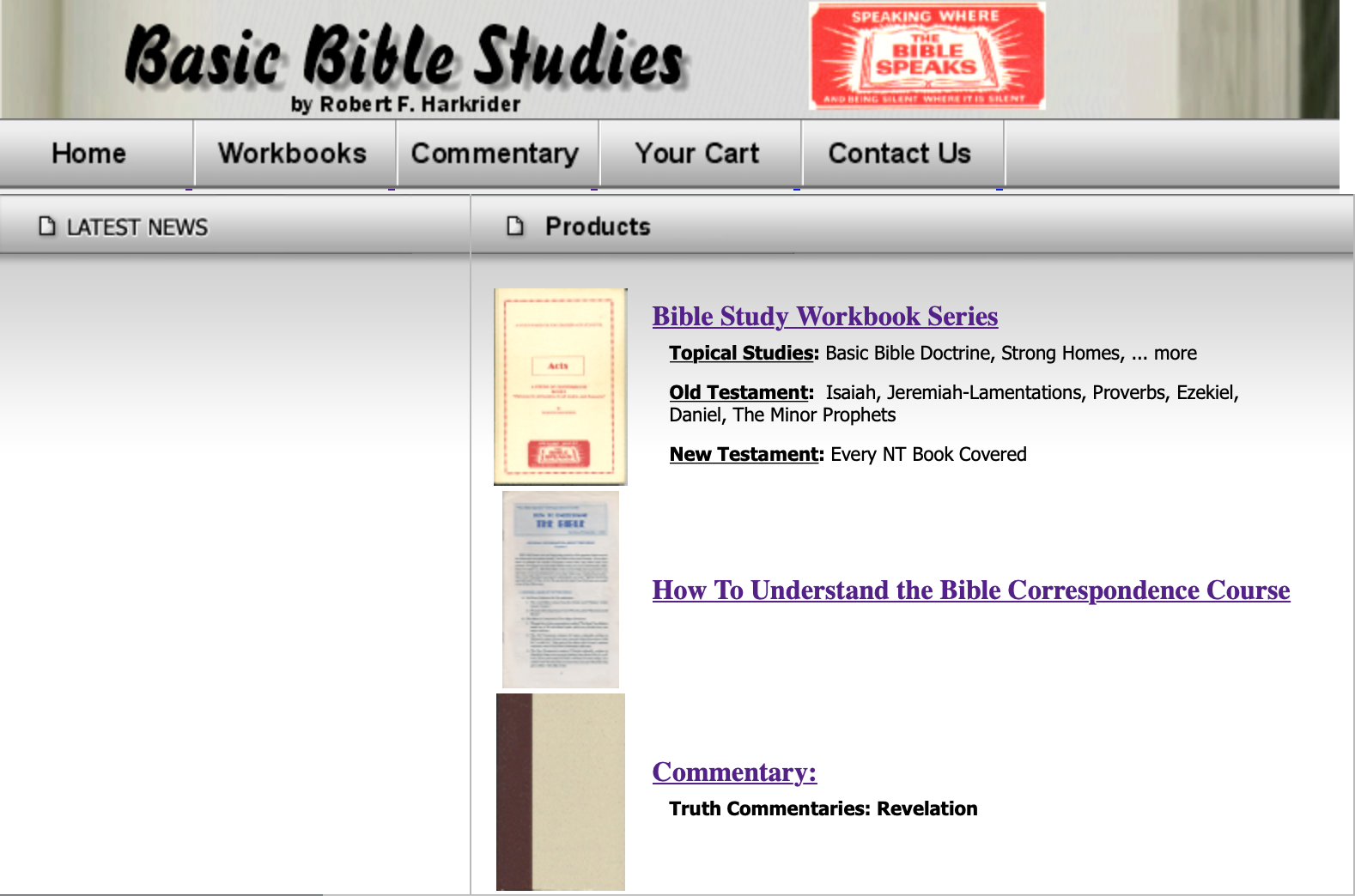
Understand the Current Layout
The original website provided a great starting point for the project and revealed the site’s main task flows. After a quick review, I hypothesized some ways to simplify tasks, remove friction and add new functionality. My goal was not to reinvent the website completely, but to remove friction and enhance its good areas.
original website: www.thebiblespeaks.net
Research: Competitors, Users & Requirements
Analyzing websites like Barnes & Noble and Amazon helped me to understand the industry. They revealed helpful processes for purchasing and downloading a book (Ex. “shopping cart” and “search” features).
Uniquely, I was a user of the product prior to taking on this project. So, I used my own experiences, thoughts and feelings as a baseline for designing.
I also researched to find out how to download an e-book after purchase, how to publish and sell an e-book and the best tools to use. I wanted to set expectations at the start, rather than making lots of changes at the end.
Organize

I used this sitemap to organize my thoughts and vision for the website. I shared it with my client and it helped communicate my ideas and allow them an opportunity to share any additional information they needed to include (ex. continue selling paperback books on website).
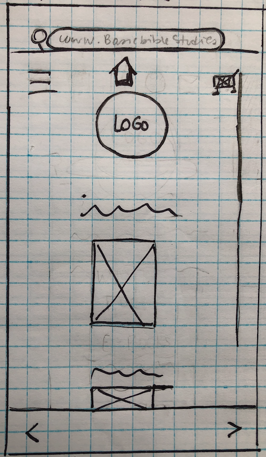
Mobile-First
Approach
Users will view the website from many different devices. To simplify the design and expose the most important elements to include, I took a mobile-first approach. Check out some of my initial low-fidelity wireframes and prototype for phone and desktop.


The Next Step - Testing!
Stay tuned for more to come.